
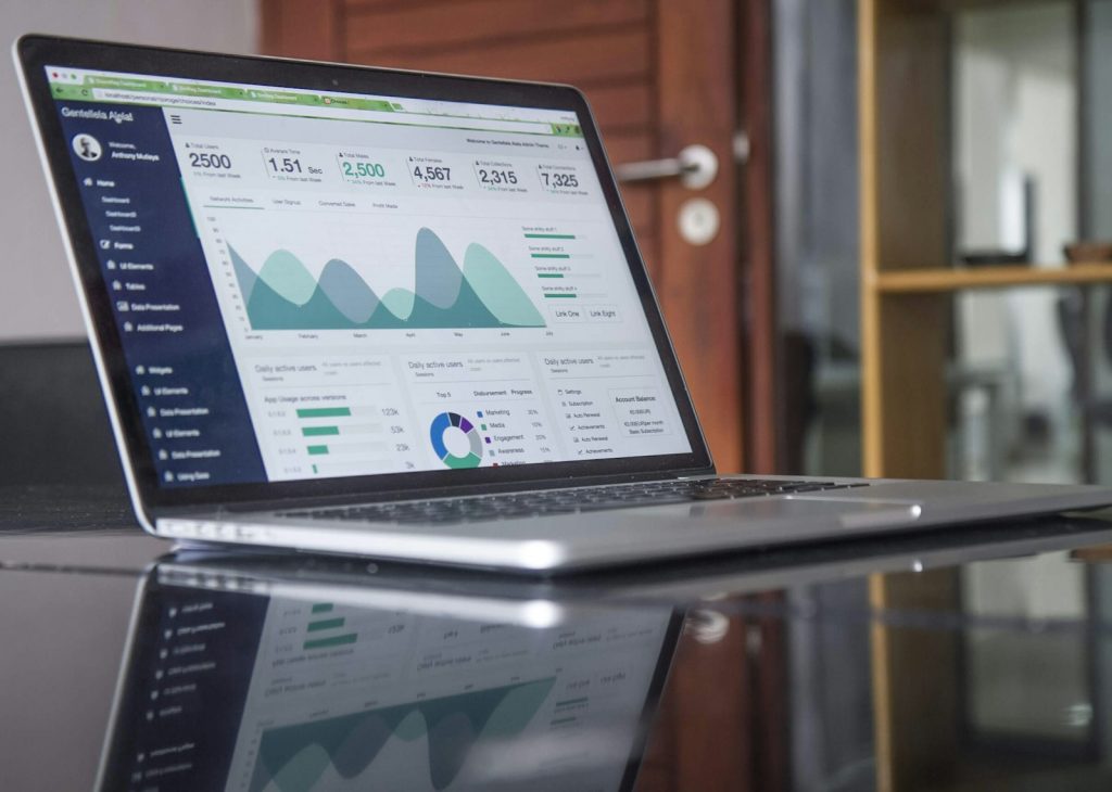
Your data has a story to tell
We have seen how Big Data is a powerful tool to discover valuable information. But without a framework to understand the conclusions, all that information stays hidden. Humans are built to understand visually: that is why traffic signs are icons, not paragraphs. Analyzing petabytes is useless if you then fail to translate the conclusions in a clear, easy and fast way.
Why visualization matters
A spreadsheet with thousands of rows is opaque. A dashboard with bar, line and pie charts turns that noise into a decision. Visualization reveals patterns, outliers and trends a table would never show at a glance.
Principles of a good dashboard
- Start with the question: what decision should the panel enable? Don’t fill it with charts.
- KPIs, not vanity metrics: every indicator should move an action.
- Visual hierarchy: important things top-left; context, bottom.
- Real refresh: a weekly panel on yesterday’s data beats a live one on dirty data.
- Self-service: let the manager explore without depending on IT for every doubt.
From data to impact
A well-designed dashboard shortens the distance between data and decision. A supply chain monitoring daily stockouts reacts sooner; a sales team seeing its funnel live focuses the conversation. Visualization is not decoration: it is operational speed.
| Without visualization | With a dashboard |
|---|---|
| Decisions blind | Evidence-based decision |
| Slow manual reports | Automatic refresh |
| Debate over numbers | Focus on next step |
At BAOSS we design dashboards the business uses — not ones forgotten in a tab. We connect your sources and turn data into decisions.
Want a dashboard that is actually used? Talk to our consulting team.